The Secret to Dining Room Wall Colors That Balance Warm and Cool Tones
Your Wall Color Should Support the Focal Point — Not Compete With It
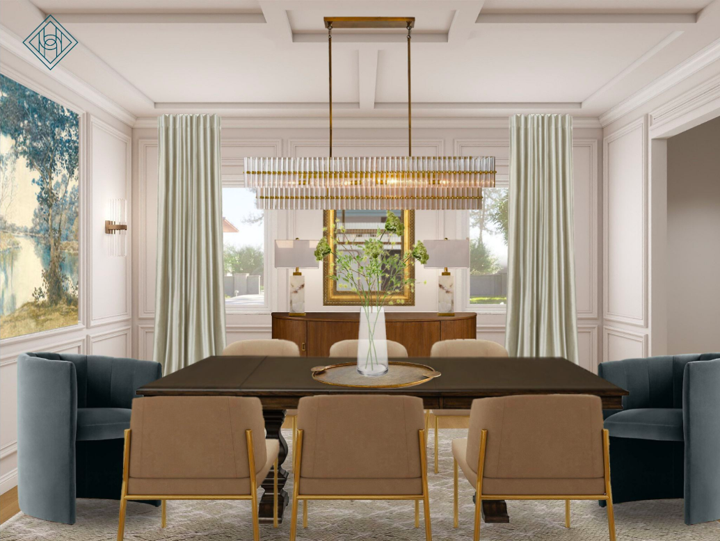
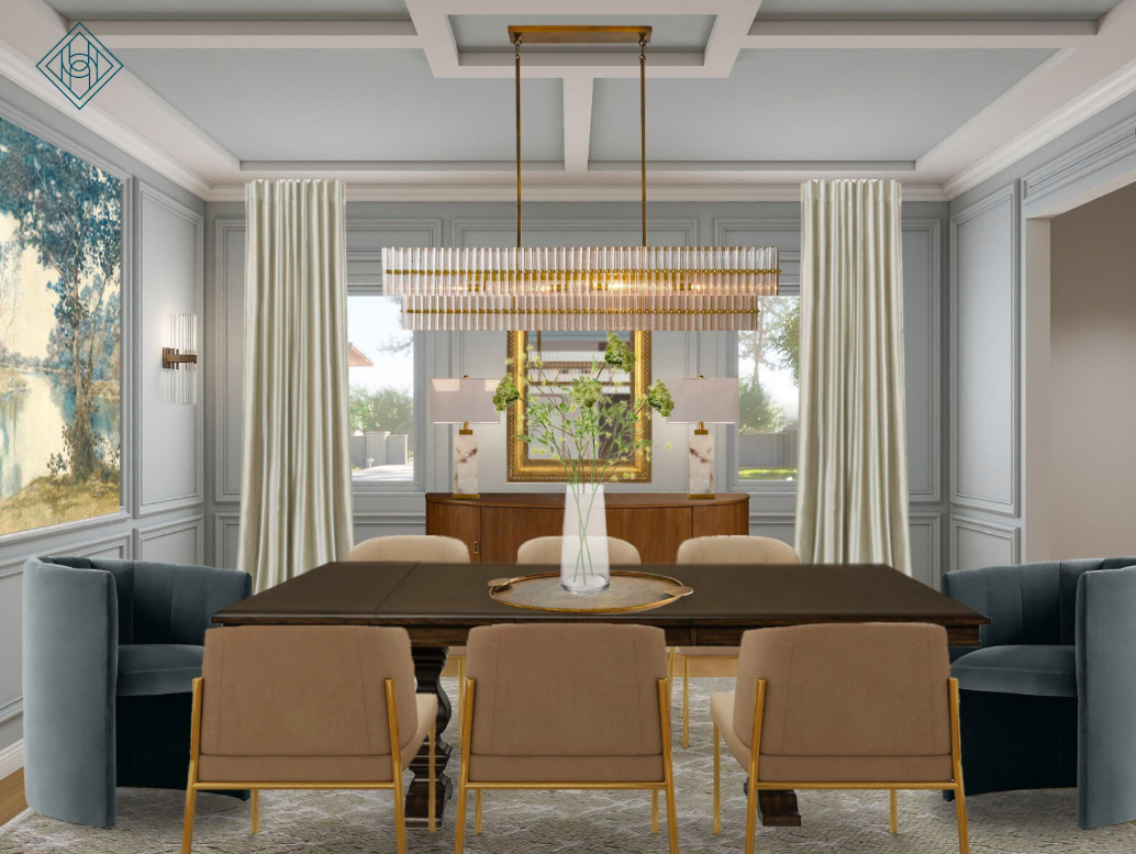
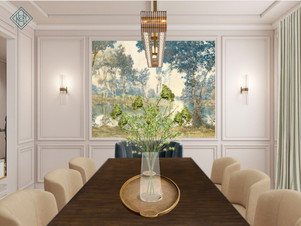
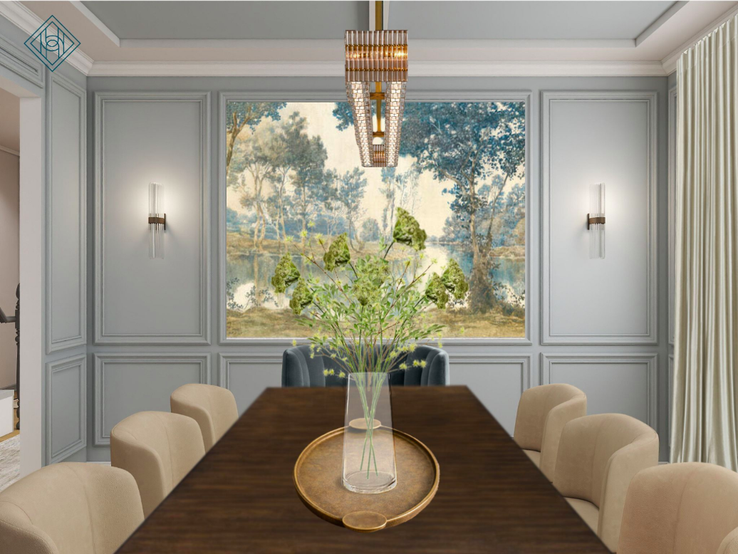
In this dining room, the large landscape mural framed in picture molding is the star. It introduces soft blues, muted greens, and warm earthy undertones all at once. Because the artwork already carries color complexity, the wall color options were chosen to frame the mural, not fight it.
Lighter neutral wall option: Keeps the room airy and lets the mural and chandelier stand out.
Deeper cool-toned wall option: Adds mood and contrast, making the art feel even more dramatic.
Common problem: People pick wall colors based on furniture alone and forget the visual weight of large art or architectural details.
Solution: In virtual interior design, we always evaluate wall color after placing focal elements. If your dining room has a statement art piece, wallpaper, or molding, your wall color is a supporting actor — not the lead.
Mixing Warm and Cool Tones Works When You Anchor the Room
This design blends:
Cool blue-green velvet captain’s chairs
Warm wood dining table and sideboard
Brass lighting and accents
Cream upholstered dining chairs
That mix works because the space is grounded by the rich wood tones and the large area rug. These elements act as a bridge between temperature shifts.
Common problem: Rooms feel disjointed when warm and cool finishes are scattered without a unifying base.
Solution: Anchor the space with one or two dominant materials. Here, the dark wood table and sideboard create warmth, while the mural pulls in cool tones — allowing both wall color options to feel cohesive.
This is a key principle in virtual dining room design: balance happens through repetition, not strict color matching.
Light Changes How Wall Color Feels — Especially in Dining Rooms
Dining rooms often have layered lighting: chandeliers, sconces, and lamps. That means wall colors don’t read the same way all day.
The lighter wall color reflects more light, making the room feel open and formal.
The cooler, deeper wall color absorbs light slightly, creating a cozier, more intimate dinner atmosphere.
Common problem: Homeowners choose paint from a swatch without considering artificial lighting at night — when dining rooms are actually used most.
Solution: Think about mood. Do you want bright and classic, or enveloping and dramatic? Virtual interior design renderings help visualize how wall colors behave with your lighting plan before you commit.
The Bigger Message: Sophistication Comes From Contrast, Not Matching
The real takeaway from these two wall color directions? Sophisticated rooms don’t rely on everything being the same tone. They rely on controlled contrast.
This space succeeds because:
Soft cream chairs balance the bold blue-green velvet
Warm brass light fixtures soften the cool tones
Traditional wall molding adds structure to modern elements
Neutral drapery keeps the palette calm
Both wall colors work because the design already has layered depth. The walls simply shift the mood — not the style.
Common problem: People try to make every finish the same temperature, which leads to flat, lifeless rooms.
Solution: Allow warm and cool to coexist, but distribute them intentionally across the room: furniture, lighting, textiles, and art.