How to Mix Warm and Cool Tones for a Balanced, Designer-Approved Living Room

Start with a Dominant Temperature
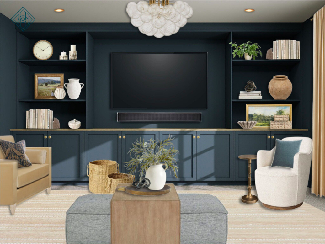
Every balanced room begins with a clear foundation. In this design, Sherwin-Williams Rain Cloud on the built-ins and walls establishes a cool base — moody and sophisticated with its blue-gray undertones. Once that anchor is set, it’s easier to weave in warmth without the two clashing.
If your space leans cool (think blues, grays, and crisp whites), balance it by layering in warm accents like camel velvet chairs, brass lighting, and natural wood tables. If your home leans warm (beiges, golds, or terracottas), bring in cooler hues through artwork, pillows, or painted millwork to create visual contrast.
Designer Tip: Pick one temperature to lead and the other to support. A 70/30 ratio keeps your palette intentional rather than chaotic.
Use Texture to Bridge the Gap
Color isn’t the only tool that defines warmth or coolness — texture plays a huge role, too. In this space, a mix of velvet, boucle, woven baskets, and brass helps blend opposing tones seamlessly. Soft, touchable textures like the boucle swivel chair and plush area rug bring warmth to the cool walls, while smoother finishes like metal and glass add modern crispness.
When styling, aim to mix at least three different textures — one plush, one matte, and one reflective. The variety tricks the eye into perceiving depth and balance, even if your colors differ in temperature.

Anchor the Room with Neutrals
Neutral tones act as a translator between warm and cool hues. The ivory sectional, pale wood coffee table, and beige rug here keep the color story calm and cohesive. These “in-between” tones don’t compete — they soften transitions between elements and help the design feel layered but livable.
If your home already has strong architectural color (like navy walls or dark floors), lean on neutral upholstery, rugs, and window treatments to ground the palette. Conversely, if your walls are neutral, consider adding depth with moody cabinetry, art, or accent paint.
Pro Tip: Look for neutrals with subtle undertones. Creams with a hint of gray or taupe often complement both sides of the temperature spectrum.
Repeat Each Tone for Harmony
Repetition creates rhythm, and rhythm creates calm. Notice how this design repeats each hue — the brass ceiling light echoes the brass drapery rods and table lamp bases, while the blue-gray pillows and moody landscape artwork tie back to the wall color. Every tone shows up at least three times, making the room feel intentional rather than accidental.
You can apply this rule in any space:
Repeat each color or finish at least three times in varying sizes.
Space them evenly throughout the room for visual flow.
Mix matte and glossy versions to keep it interesting.
Even a single accent color (like the teal pillows here) feels cohesive when it appears consistently — not just in one corner.