How to Add Color to Your Home Without Making It Look Busy or Tacky

Start With a Neutral Base
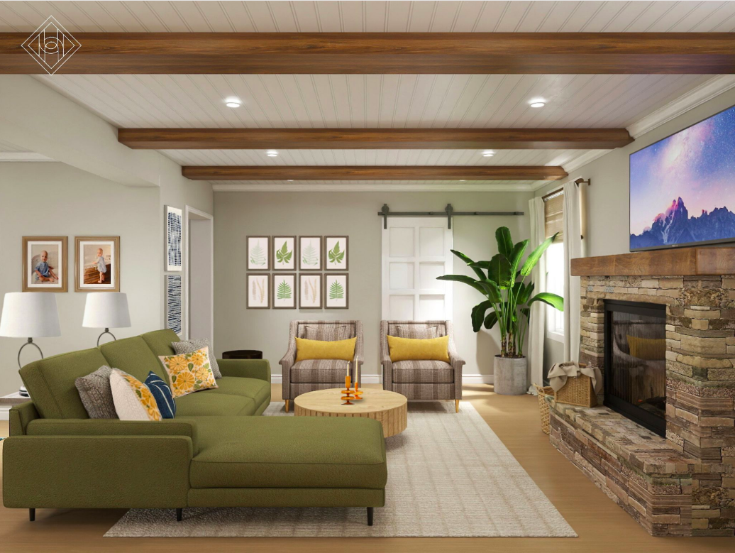
Before you add color, ground your space with a clean, neutral foundation. Think soft whites, warm taupes, or light grays on walls and floors. A neutral base gives your space flexibility and ensures your pops of color stand out without competing.
In the room above, the walls and floors are kept calm and creamy, allowing the olive green sectional and mustard accents to shine without overwhelming the space.
Designer Tip: Don’t underestimate the power of restraint. When your backdrop is subtle, even bold colors feel balanced.
Choose One Dominant Color, One Accent, and Repeat
When adding color, pick one main hue to anchor the space, then bring in one or two accent colors to add dimension. Repeating those tones across different elements—like pillows, artwork, curtains, and rugs—creates cohesion.
In this design, olive green is the hero color, echoed in the curtains and sofa. Mustard yellow serves as the playful accent, seen in pillows and armchairs. Navy adds contrast without clashing.
Quick Formula:
Dominant Color (60%)
Accent Color (30%)
Bold Pop (10%)
This creates a balanced palette that feels layered, not loud.
Use Pattern and Texture to Add Interest
Color doesn’t have to be flat. Pattern and texture are great tools for adding richness without visual overload. A velvet pillow, a textured rug, or patterned upholstery in the right color can bring life to a room without feeling kitschy.
In the photo above, subtle stripes on the chairs, woven textures on the barstools, and organic wall art in warm tones bring visual interest without overcomplicating the color palette.
Try This: Look for tone-on-tone patterns, like navy-on-navy or mustard with a slight print, to add depth without busying the room.
Layer With Intention, Not Impulse
The biggest reason color can look tacky? It’s often added without a plan. Instead of collecting random colorful items, curate intentionally. If you find a piece you love—like a bold rug or bright artwork—build the rest of your color story around it.
Layer in smaller accents like throw pillows, candles, or vases to echo those tones and make the space feel styled, not random.
Designer Secret: Stick to 3-4 color families max in a single room. More than that, and the eye loses focus.